Café Sïo

A new Culture Café - Café Sïo who see the value in doing things a little bit differently. 


Project Scope

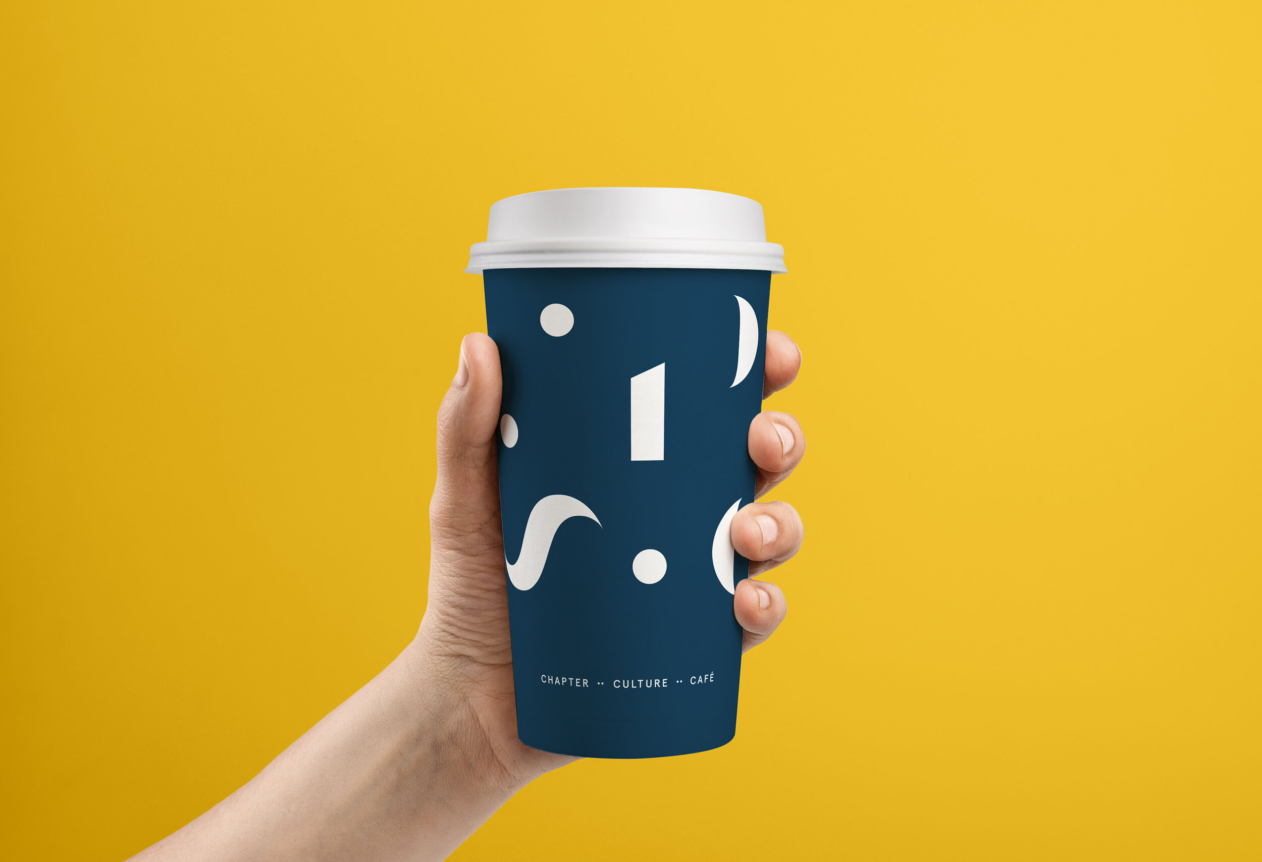
Packaging
Typography
Art Direction


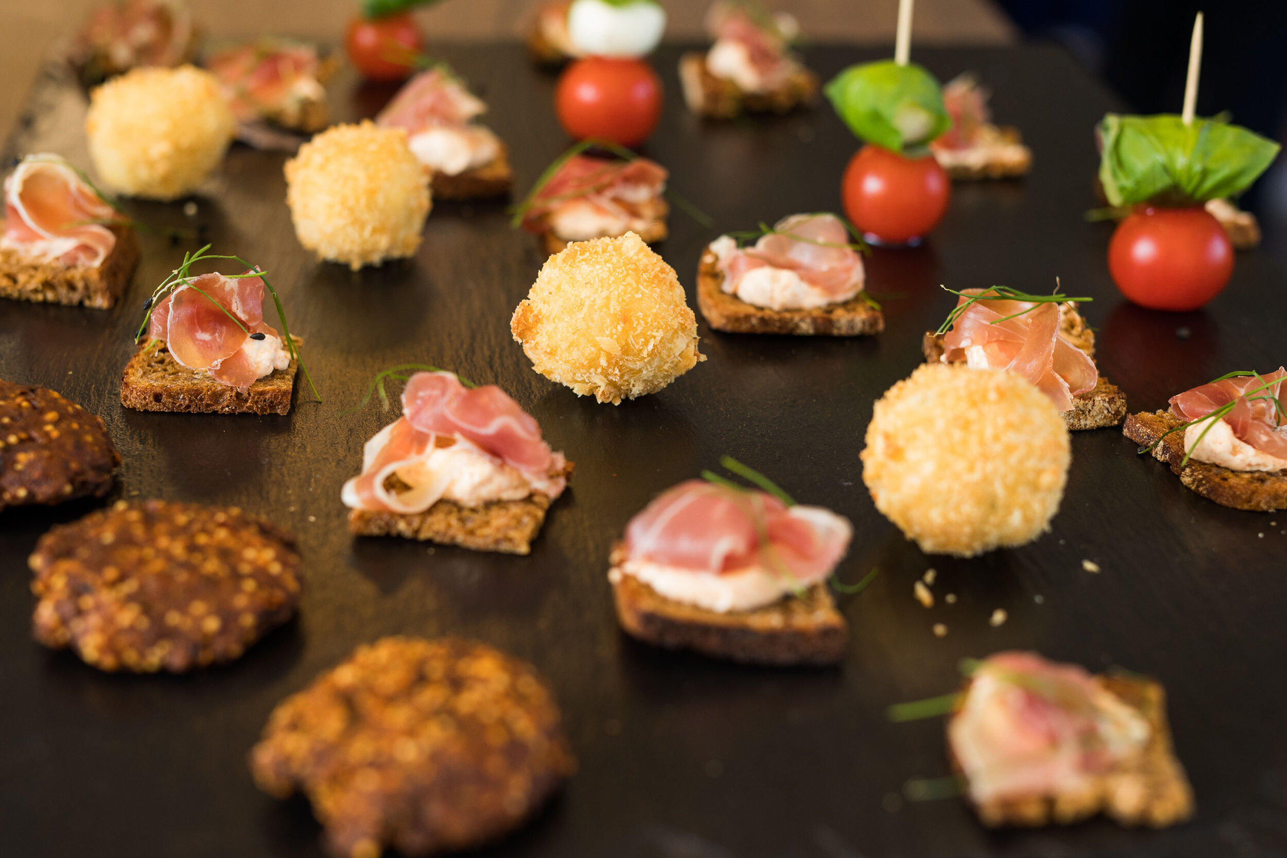
One of only a few independently owned ventures amongst the many chain restaurants in the Bay offering quality local sustainable, nutritious and flavoursome seasonal produce as well as a flavour of its unique artistic programme.


We developed a new brand name. ‘Sïo’ which is the Welsh word for ‘buzzing like a bee’ and we think it is a fitting name for the artisan café in a contemporary, creative and energetic location.

S dott-01.png
 

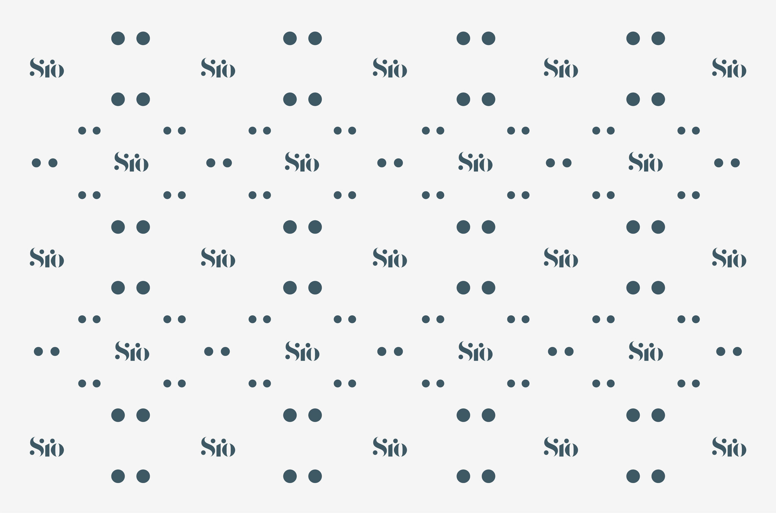
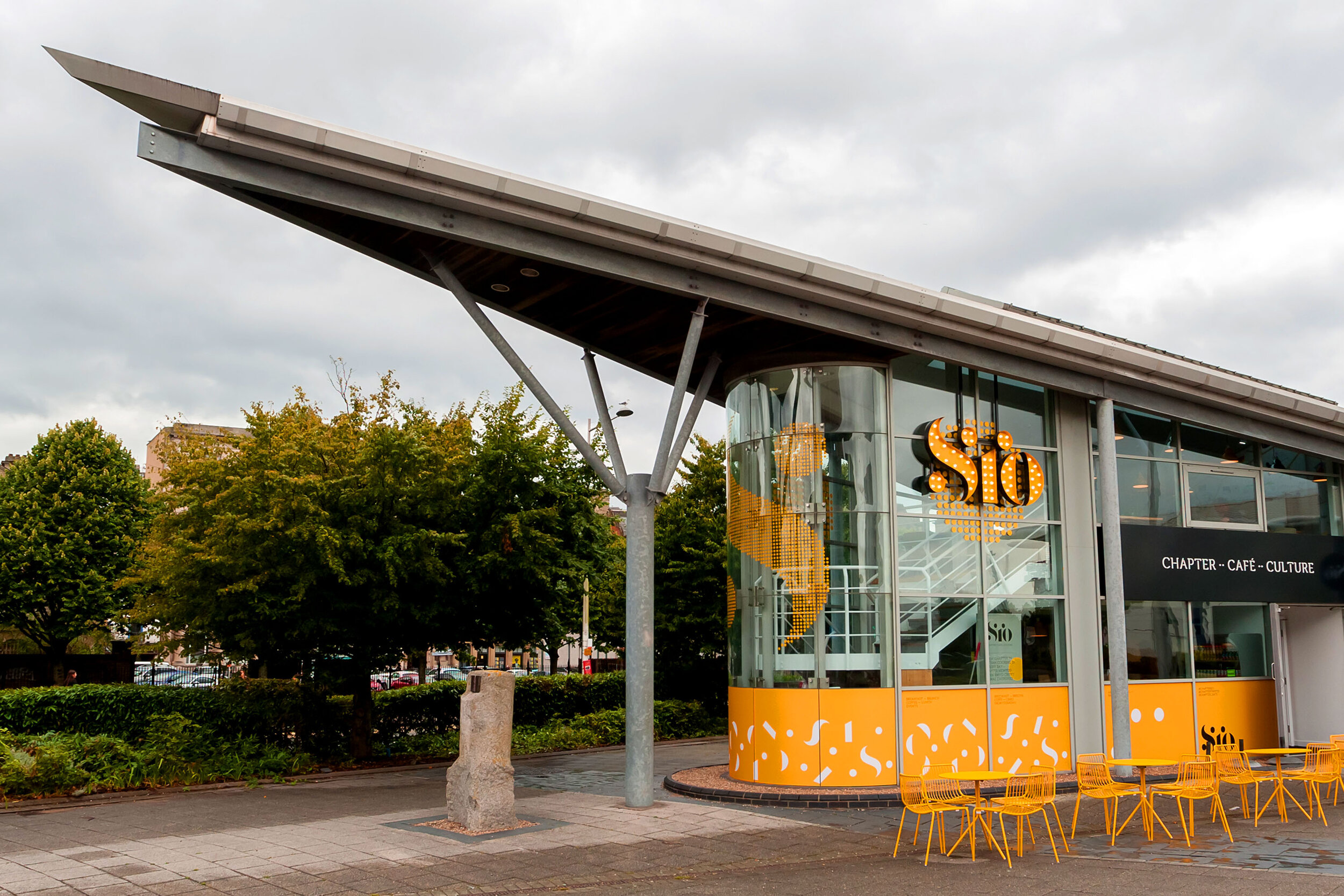
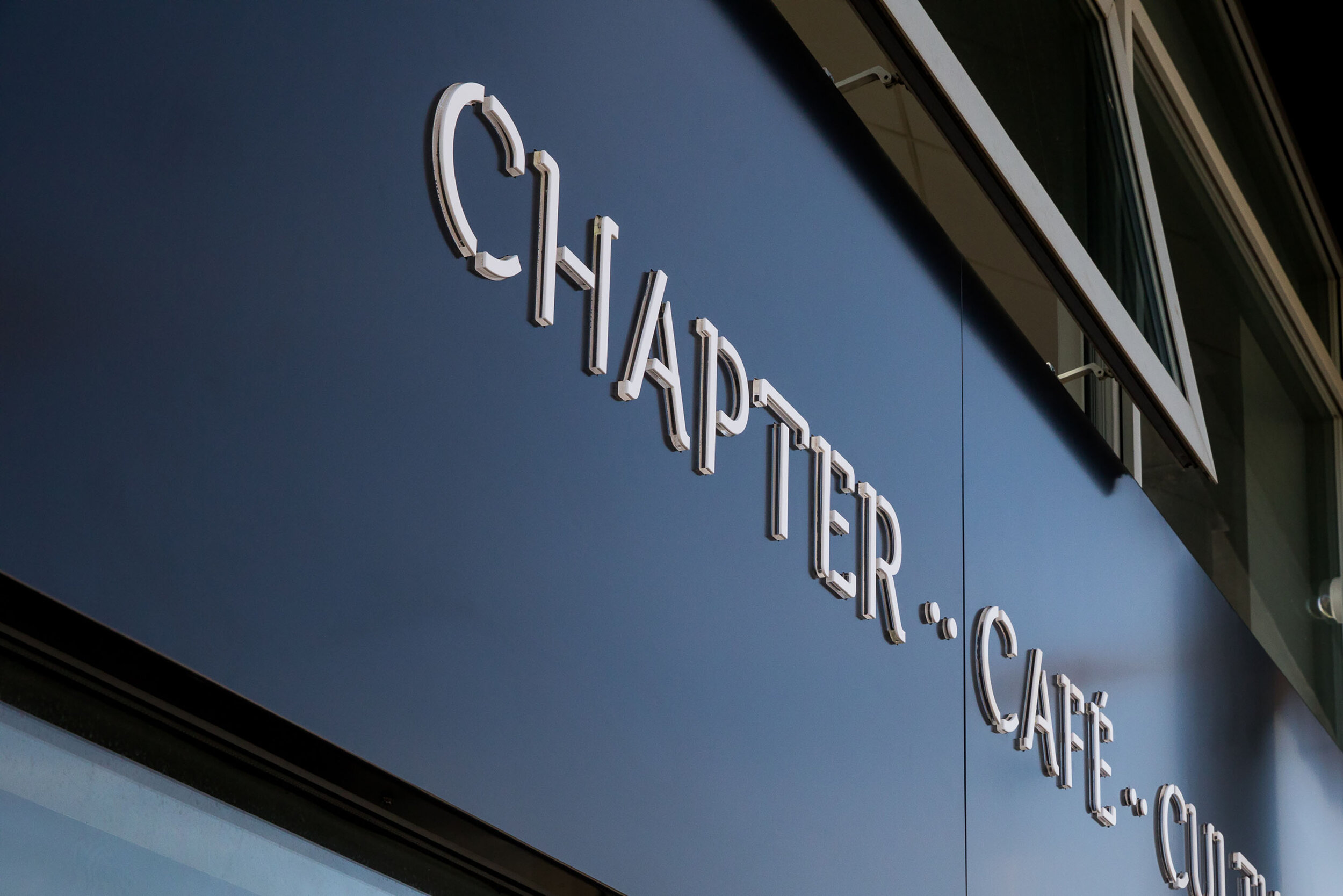
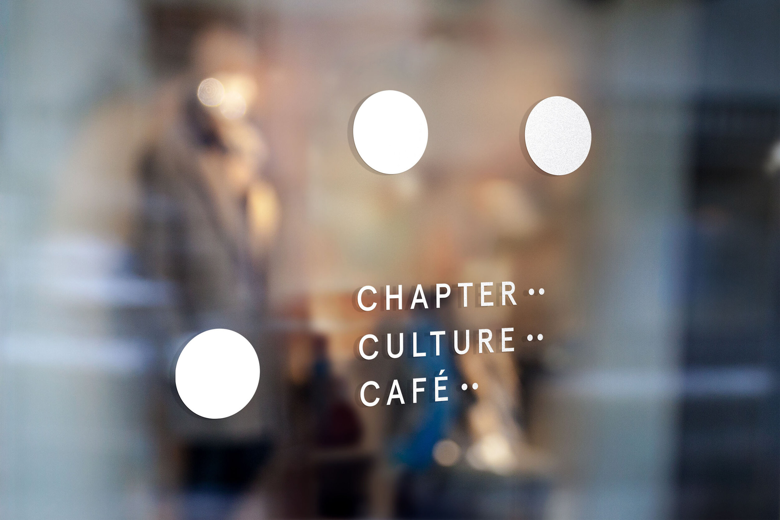
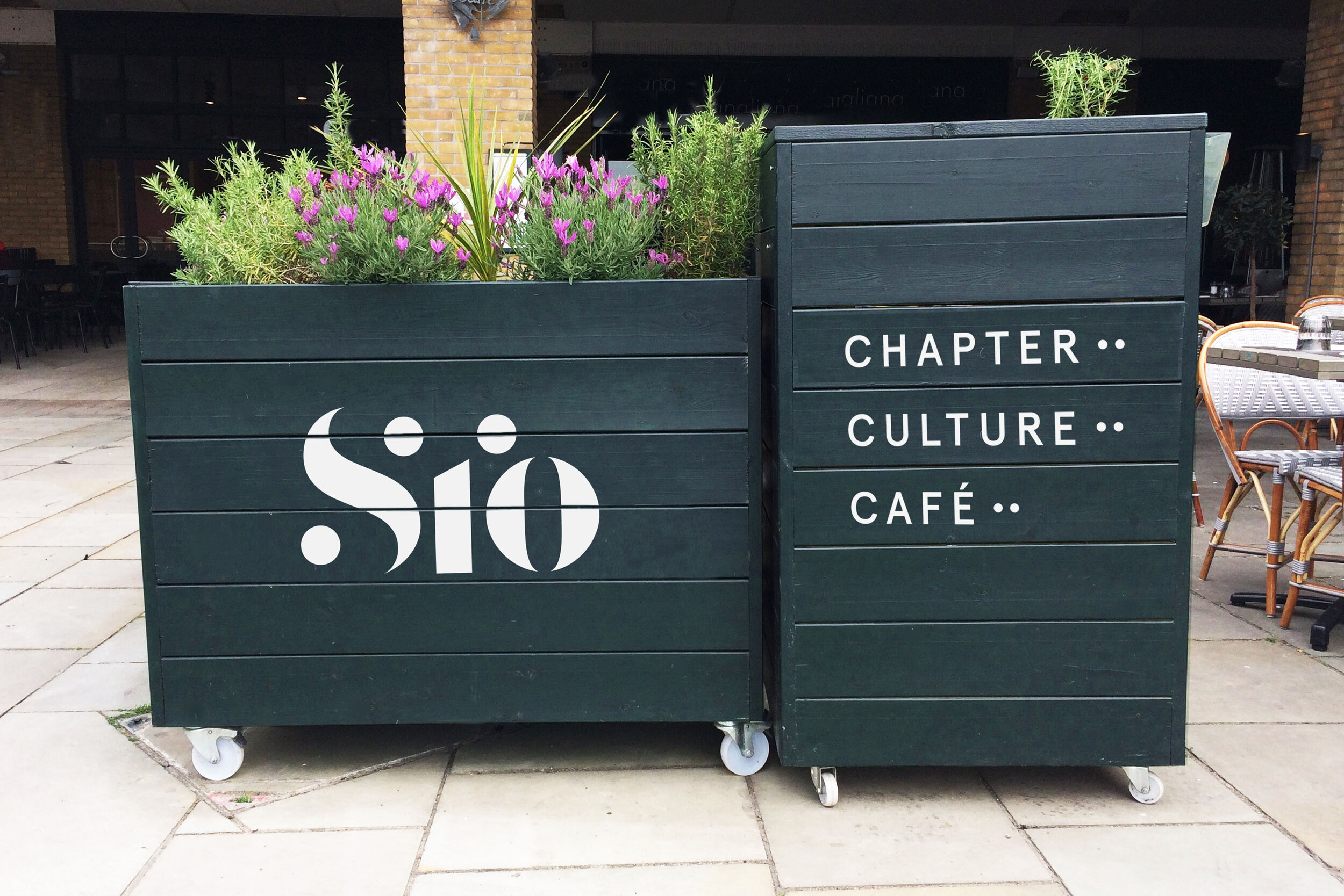
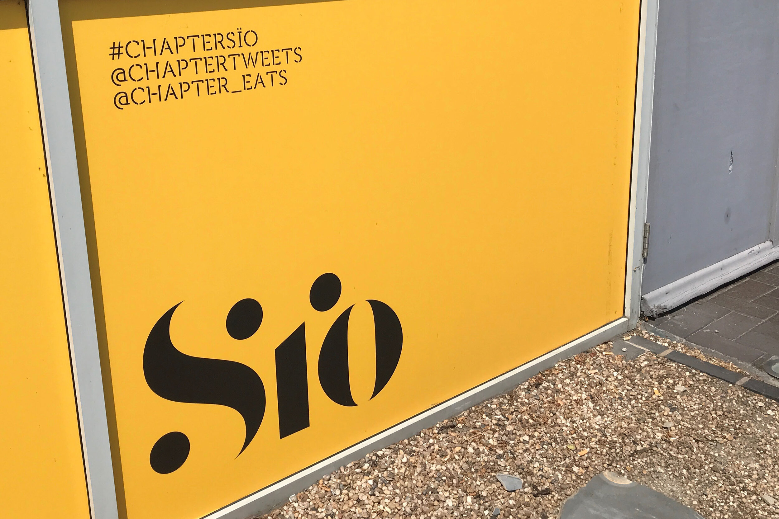
As part of their brand language we designed a custom designed font and a number of assets from the logomark which was used for exterior signage, window vinyl and bespoke menus harnessing the uniqueness of the Café’s offering and expressing this in every small detail.


"Finding the right branding partner was vital to the success of this project. We researched design companies extensively within the UK, and, ultimately, we were drawn to the quality and creativity of Kutchibok’s work. Kutchibok understood our target demographic, they were very professional throughout the whole process – they were thorough and thoughtful; they were great fun to work with and they created a beautiful brand that captured the essence of Sïo. We couldn’t be happier with the outcome!"

Jamie Rees (Head Of Marketing & Development, Chapter)

Previous
Previous

Family Lines Family Trails

Next
Next

Boombox